Visualizing Data and Situations

September 28th, 2016 by Potato

Recently I got an email from Chris (his mailing list is actually good, BTW). He includes these neat sketches to try to understand his money and see things in a new light. A few weeks ago was one on his money infrastructure, which I’m hoping he’ll turn into a post for non-subscribers to see, but the one I want to touch on this week is a sketch of his irregular income through the year that he just sent out. It’s basically a bubble chart (though he uses squares instead of bubbles), showing how his confirmed income varies through the year.

RagstoReasonable irregular income figure

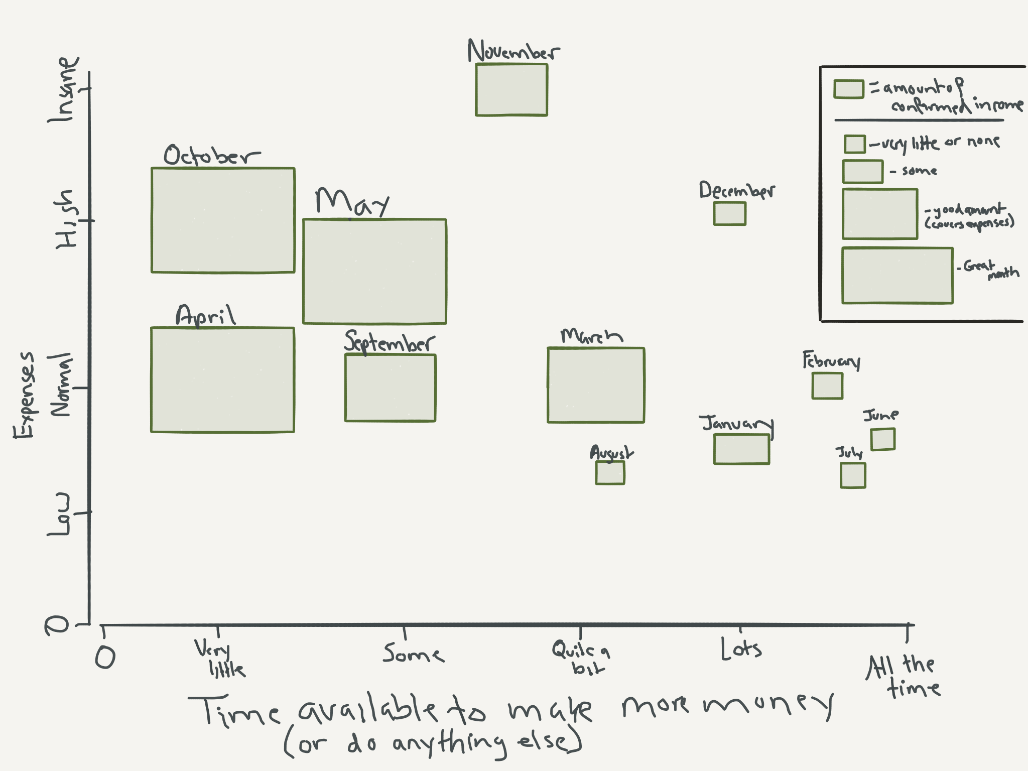
I saw that and thought neat, this is presenting some information in a way that will make people think.

I then thought “this can be presented differently, especially if I would want to use this information to plan my freelancing activities.”

In that figure, he has as his independent axis (x-axis) “time available to make money”, with the months scattered all around, and expenses running up the left side. But you can immediately see a strong relationship between the size of the boxes (committed income) and time available to make money — when he has less committed income, he has more time to make money, which is not very surprising and perhaps not what you want to take away from the chart.

Instead of scrambling the months, we can rearrange it chronologically.

He also has expenses and income as separate variables for each month. Sometimes it’s useful to think about those as separate things, especially when you can attack them from either side. But if you’ve more-or-less figured out your expense side and want to focus on making more money (as the initial x-axis implies), we can instead plot the difference between expenses and income — when are the shortfalls? How do the shortfalls line up with opportunities to make more money? Are there blocks or are they one-off months in islands of pre-committed business?

RagstoReasonable variable income chronological

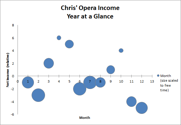
So now with net income, time available, and time through the year plotted I could use this layout to start planning my side business activities.

As Chris, I could see that from November through February I have a large shortfall in budget, and a decent amount of free time, so this period I’d try to book up with freelance work, with some possibly spilling into March to wind-up (and I’d have to be done for the big Opera period in April). Then in May some time opens up, but the motivation to get stuff going won’t be high as there will still be positive net income. However, there will be minor shortfalls all through the summer with lots of time to spare, so assuming that Chris needs to account for lead time to book clients, he would use the time in May to do that business development, and then work freelance lots through the summer. Then come October, Chris really will have no time to spare, so booking business for the Nov – Feb period will likely have to wait until November (and even then the time is not as open). That means he’ll need to budget to deal with that big shortfall expected in Nov, as it’ll take some time for the freelance income to pick up then.

So here I’ve abstracted away a variable — I’m assuming that I’ve already dealt with planning my [Chris’] expenses, and am trying to visualize the data in a way to help me manage a freelance career on top of a singing career. And this may be a more useful visualization for that particular problem.

But that doesn’t make this a better general approach. After all, some of Chris’ expenses may be variable and flexible, and he would want to plan out when to schedule those based on when there will be money in his accounts after paying gigs, and when he will have time. In that case he’ll want to see income and expenses separately — indeed he may want to collapse income and time available to focus on time through the year and then have different bubbles overlaid for different kinds of expenses. Then he could plop some expenses in different places to see what would fit best for him. For example, he may want to schedule his dental appointments in November and May, when he has time and money after his busy October and April gigs. And indeed, he had just such a visualization sketched out when I chatted with him about this.

With some things in life, especially personal finance, there are many more ways to look at data and to try to present it in ways that help guide different decisions. I’m trying to make use of this more in the course — there’s lots of line and scatter graphs, but also a few simple sketches and pictograms with bunnies. But there’s lots more room to go, and I’m excited to see other people sketching things out in different ways

Anyway, stay tuned to ragstoreasonable as I’m sure Chris is going to come out with some neat visualizations and sketches soon (peerpressurepeerpressurepeerpressure).

Short Updates: Renting in Toronto, Because Money, Course

September 22nd, 2016 by Potato

I’m heading into the busiest three weeks of the year for me. Caffeine levels are at max, and I’ll be trying to survive the stress and sleep deprivation until this project is done, so don’t expect a long post in the next while. Here are a few short updates though.

Renting in Toronto: I’m scoping out rental houses in Toronto to get a feel for where current rents are. For several years market rents have been quite stable and it’s been easy to conclude that the absurd price:rent ratios were not going to be fixed by rents increasing. Every now and then a rental would come out way above market, where clearly a landlord was trying to actually cover their costs on a recent purchase price instead of collecting market rates and hoping for appreciation. However, this fall I’m seeing that rents are actually up, with a huge spread in prices (and price:rent). For houses that would be ~$1.3M in a particular neighbourhood, I’m seeing rental rates from $2600 (about where prices from last year would be with inflation) through to $3600. And it’s not just “that one crazy listing” (though one listing did sit for over a month at that top end and is now down — not sure if it found a tenant or just got pulled), there are places at each point in the spectrum, which makes for price-to-rent ratios of anywhere from 460X to 375X — a pretty big spread.

Even at the high-end of that range, renting is still the better deal (because prices to buy are crazy), but it’s surprising to see nearly a thousand dollars a month in possible rent inflation in just a year’s time. Moreover, I’ve commented before that one of the nice aspects of renting over buying is that you get a lot more for your housing dollar — we could never afford to live here if we had to buy. Well, if rent rates are increasing that much, we might not be able to afford to live here even as renters. On the one hand that’s a scary thought, on the other, I don’t really think Toronto’s priced dual-professional families out of even the burbs forever. I’ll have to keep a closer eye on the market to see if it’s just an anomaly of a few crazy people putting their listings up at once without knowing the market rent, or if it’s truly gotten that much more expensive.

In discussions with a reader on the rent-vs-buy choice (which I’ll turn into a post later), I had to bring up the point that buying is in many ways easier (distinct from better) when you’re looking for a detached house. While there are detached houses available, and while it’s the better move financially to rent, there are 20 or 30 for sale listings for every house for rent. It can take months of looking to find one that ticks all the boxes for you, and part of what makes that a challenge is that as a renter you’re almost exclusively looking for as-is properties (or close enough to as-is — it’s possible to put some work in to a place to make it your own space with a long lease or even to negotiate repairs and upgrades with a landlord, but you’re not going to do anything major), whereas when buying you always have the option of getting any old place and gutting it.

I also volunteered to re-write the rent-vs-buy calculator page as part of the Reddit /r/PersonalFinanceCanada wiki effort. I’ve written so much over the years on real estate and the rent-vs-buy choice and the math involved, but I really don’t have a good “start here” resource, and the last time I tried to write one it got way too long and ranty (and when I tried to make a “start here, how-to” page for investing, it turned into a book). Again, busy now, but look forward to something like that later in the fall — and if there’s already a good guide that would serve the average Redditor off the street, let us know and you’ll save me the trouble.

Because Money: I’ve been a guest several times on the Because Money internet show (in fact, the guest with the most appearances on the show). This year I’ll be joining the team as a producer — basically clicking on things while the hosts and guests chat, and every now and then throwing graphs up on the screen because I’m a nerd. We’ll also have MYD doing the hard work of off-line producing, which will make Because Money a downloadable audio podcast and not just a YouTube sensation. For season 3 Chris Enns will fill the seat of Ensign Redshirt/Male co-host #3, and we were really clear in our enunciation of the words of warding to try to ensure that the same curse does not befall him.

Course: This busy period was not unexpected, and that’s why there was nothing in the release schedule for the course in September. However, things started getting busy earlier in August than I had expected (plus I actually took an actual vacation instead of using that time off work to work on the course), so most of the modules I had promised for August are not up yet. Sorry about that, I’ll try to get them all done in the October update (none of the August videos are shot, but most of the articles are at least partway finished).

Questrade: They can’t leave well enough alone over there, and have tweaked their UI again. It’s a fairly minor change so I’m not going to rush to update the errata for the book.

Indexing and Valeant/Nortel

September 20th, 2016 by Potato

An active portfolio manager recently criticized index investing because Valeant became the biggest TSX component and then blew up, as Nortel did in ages past. The implication being that active investing would have avoided concentrating so much into a stock like that.

This is a flawed argument. First, he’s suggesting that active management could have avoided the Valeant collapse, which we can’t just take as a given. After all, it didn’t get that way because of the index investors — Valeant became the biggest TSX component because on average active investors gave it that valuation. Now, it’s possible (especially in this case of a cross-listed stock with an international presence) that American active investors are what drove the price up, leading to its over-weight status in the Canadian index (even if Canadian mutual funds didn’t hold it to that proportion), or a small minority of Canadian active investors just going crazy for the stock drove up its proportion in the index, but sparing the portfolios of most active investors.

Whatever, it happened: Valeant became huge then blew up1. That makes 2015 an easy comparison year for active funds versus the index, right? And indeed, over half of Canadian equity funds managed to out-perform the index that year, a massive increase over the typical numbers. However, despite the gimme at the end of the period, nearly two-thirds of funds still under-performed on a 5-year basis — this is clearly not a fatal flaw in index investing.

Which makes it a really insidious sort of criticism because there is a nugget of truth in there. It would be better if bubbles never formed and blew up, but that’s too hard to avoid in practice, and over the long term (which is what matters), indexing is still the better bet. Even if every once in a while the indexes do throw a soft pitch inefficiency to the active investors, it’s too hard to take advantage of (net of fees) consistently enough to win out.

Oh, and while 2015 was a pretty good year for Canadian active investors versus the average, note further down in the report that 85% of US equity funds under-performed the S&P500 that year, and 99% under-performed on a 5-year basis.

Every now and then index investing will include blow-ups like this (or miss run-ups), making an easy comparable for the active managers. Despite the odd case of that happening, over the long term index investing has been the better choice.

1. Fun fact: VRX is the biggest near-miss in my active investing portfolio. Screwing that trade up is perhaps the strongest signal that I’m too busy for even a small active “play” portfolio and it’s time for 100% indexing for me. I decided to short VRX in August 2015, after the AZ Value posts but before Philidor hit the news. I put in an order to buy some puts, but was too stubborn to cross the spread. My bid did not get filled at the end of the day, and then I was too busy with work to enter it again the next few weeks. Then the Philidor revelations came out and I was dumb enough to think that falling from ~$300 to ~$240 meant that I was chasing it down and most of the negative news was baked in. If I had just been willing to cross the spread and pay like $20 more for my puts, or even to come back and keep the bid alive, I would have had about a 15X return on that short. It is no small source of embarrassment and rage and kicking myself that I actually had done the research and entered an order, and still managed to miss out. As Wayfare said, “there’s this great book on passive index investing you should read…”

The Index Card

September 15th, 2016 by Potato

In looking for other descriptions of simple ways to plan and manage your finances, I recently read The Index Card.

The backstory is neat:

When University of Chicago professor Harold Pollack interviewed Helaine Olen, an award-winning financial journalist and the author of the bestselling Pound Foolish, he made an off­hand suggestion: everything you need to know about managing your money could fit on an index card. To prove his point, he grabbed a 4″ x 6″ card, scribbled down a list of rules, and posted a picture of the card online. The post went viral.

An early version of the card is available online at many places, including this story at NPR. The final book tweaked things a bit, but from a quick note surprisingly little changed.

I love the idea of a card like this: a simple set of guiding principles, presented in a really simple way (even the medium of the index card helps reinforce the idea that this shouldn’t be too scary).

However, I can’t say I’d recommend the book for Canadian readers: beyond the real basics of paying off your credit card every month, most of the book is really geared to Americans. With lots of focus on 401(k) plans, 30-year mortgages, and health insurance woes, big portions of this book don’t carry over well across the border. I also wasn’t a fan of the third person voice shifting between the two co-authors. “While working on Pound Foolish, Helaine… Since publishing Pound Foolish, Helaine has sat through… When at the University of Chicago, Harold…”

But let’s move beyond the book to focus on the concept of the index card.

There are lots of things you could include in a high-level summary or set of guiding principles that fit on an index card. And you might build a card differently depending on whether you’re trying to create one for yourself (a la the One-Page Financial Plan), or create a general one to hand out to university students as they graduate or even the public at large.

What specific items to include (and which to exclude), and how to set up such a card is up for a lot of thought and debate. For example, the eponymous index card that Harold made had “pay your credit card balance in full”, but that came after a bunch of stuff on investing and saving. If you’re already saving and investing, do you need that credit card advice, or can it be assumed? If you need to spell out paying off your credit card, shouldn’t it be item #1? And if you have to spell out how credit cards work, do you also need something about car loans? Same with investing: if you already have a point about investing in low-cost index funds, do you need a separate one about not investing in individual stocks? His card also had something political but nothing about donating to The Princess Margaret Cancer Foundation and other charities, which to some people is more important.

There are lots of ways to try to tweak that original card, or to set out to make your own.

Here’s where you need to know your audience: what are the important things to highlight and spell out, and what can be assumed or implied? This is a lot easier if you’re writing a card for yourself than if you’re trying to make the perfect generic card.

Then I think a really good idea is to remember what index cards were originally for and build that in. For those of you who are too young to remember (and those who don’t have an antique card catalogue in your living room to help remind you), before computerized databases and indexing, meta-information about books and other materials at the library was kept on index cards. So you could flip through a stack of index cards to find something you were looking for, then that would point you to the long-from material (a book or file somewhere). Your index card can do just that too: you can write it down on an actual card or use Word or Google Docs to write it out, then link to more information somewhere else. Then if you have a point to make and it’s debatable whether it’s a stand-alone point or really a sub-element of another point, you can include it in the detailed breakdown linked.

So your short summary of personal finance principles can fit on one small piece of cardstock, demonstrating that it’s not all that complicated and that you can do it. But you can link to the more detailed practical information you’ll need from time to time to actually follow and implement those principles. I did something of the sort with the reading guide, but you can set your index card up to link to your own shorter, more relevant summaries.

Here’s how I would set up a generic index card:

  1. Understand why this is important to you. [References: Sandi’s Spanish River talks, posts, One-Page Financial Plan [sic], Wealthing Like Rabbits]
  2. Get out of debt, and stay out of debt. [pay off credit cards, debt blogs, Gail Vaz Oxlade books, etc]
  3. Create a budget, and live below your means. [budgeting tools, different approaches, more books, rent vs buy resource, cars and other big-ticket item resources]
  4. Have an emergency fund and disaster-proof your life. [resources on emergency funds, insurance, Stop Over-Thinking Your Money chapter]
  5. Plan for retirement, even if you love your job. [resources]
  6. Invest for the future in low-cost, broadly diversified funds, using employer matching, TFSAs, RRSPs, etc. [Value of Simple, Practical Investing Course, other resources]
  7. Automate as much as possible to circumvent bad behaviour and improve odds of success [resources on behavioural finance, creating processes, paying yourself first, etc.]
  8. Get help when you need it from people working for your best interest [directory, other resources]

And just like nearly every review of The Index Card suggests changes to the card Harold originally created, this generic card has a lot of room for personalization and discussion & debate. For example, I assumed a lot of things could just be folded under “create a budget”, which otherwise might be rich points of discussion and education on their own. I didn’t mention taxes anywhere, nor pensions or retirement income, but maybe a generic card should include “file your taxes every year”. Nothing about sharing money with a spouse, educating your kids, or paying financial literacy forward, though those could also get top billing depending on the audience. And I could include an ur-point about financial literacy: it’s important, and it’s up to you to learn enough to protect yourself and get by in this world.

What would you include on your own card?