Rent vs Buy Sensitivity Graphically
December 29th, 2011 by PotatoI mentioned a few times that it’s important to look at a range of different assumptions before making a large decision, such as deciding whether to rent or buy. It can sometimes take a fair bit of research to get to those assumptions in the first place (what’s an appropriate range? Why can’t I just assume 20% returns or no inflation?).
But as handy as a spreadsheet/calculator is for figuring that stuff out, it’s hard to show multiple outcomes, so here is a little graphical depiction of when it’s better to rent vs when it’s better to buy after 20 years, and by how much, under various assumptions — holding the others constant with the “base case” numbers. It’ll give you an idea of how sensitive the analysis is to various factors.
The “base case” being the numbers I put into the rent-vs-buy calculator spreadsheet in this post: namely, 2% rent inflation, 2% house appreciation, 7% investment return, mortgage rates of 2.8/4.5/5.5% over the first 5, second 5, and remaining years, and of course, a price-to-rent multiple of approx 215X.
The shaded green areas show where it’s better to rent, and by how much, while the shaded purple areas show where it’s better to buy, and by how much. I’ve put them all on the same scale for easy comparison. You can see there’s a lot more green than purple. Yes, purple does exist, and there are scenarios where buying is better (high house price appreciation, high rent inflation, low investment returns, low price-to-rent, etc). But based on what I think are the likely range of outcomes, it is much more likely that renting will be better for us, and by fairly significant margins.
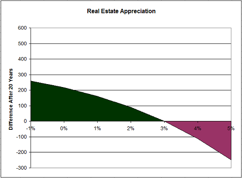
Here’s the impact of different outcomes for appreciation, with all the other factors as in the speadsheet posted before (i.e. 215X price-to-rent multiple, etc). You need to be quite bullish for quite a long time to get into the purple region at the right side of the chart (in effect saying that you think a $500k house today will be $1.3M 20 years from now).
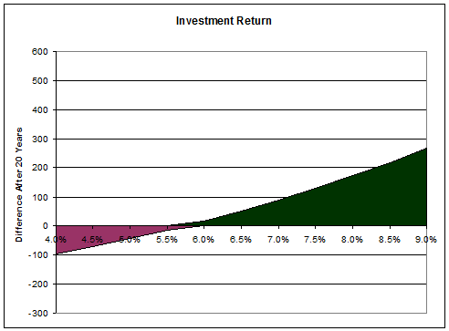
The different outcomes for investment returns:
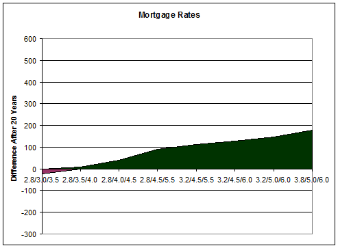
With several time points to pick from (0-5 years, 5-10 years, 10-20 years) it’s tough to make a fully-featured chart, but here are a number of options. Even assuming very low rates lasting for a very long time (2.0/3.0/3.5) only barely nudges owning ahead; in the green triangle, no truly scary rates are featured (nothing above 6%). The impact of mortgage rates:
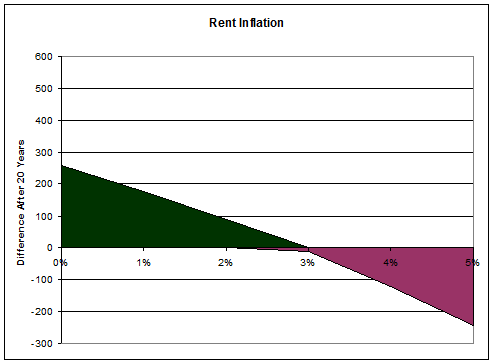
I was a little surprised to see that the outcome was so sensitive to rent inflation:
And how the outcome changes with different price-to-rent multiples (the base case was 215X in the previous posts, more on that below the figure):
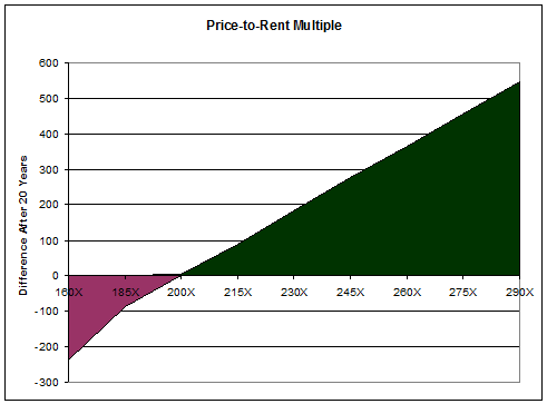
Perhaps unsurprisingly the biggest single factor is the price-to-rent ratio. Fortunately, this is the one with the least uncertainty: identify your comparables — your living arrangement options — and then you’ll have the two prices to use rather exactly. I was attempting to be generous in the original post, using “just” a 215X multiple when I have seen plenty of examples in the 250X-275X range, and could probably cherry-pick even higher. I thought 215X was more defensible: though there may be some outliers, that seems to be about the floor in Toronto, so I could trust that you could go out and do your own comparisons and find similar or higher multiples. The original point was that even with generous assumptions, it’s hard to make the case for owning.
So maybe even though I thought I was being realistic, you thought the investment return assumption was a little high, or the long-term appreciation a little low — that’s fine, since the price multiple is a huge factor that may trump those smaller quibbles. Especially when a more realistic multiple for Toronto may be 250-275X.
Oh, and BTW: Wayfare has found out from the old landlord that indeed, the place did not get rented out at the original asking price of $2100, but rather $1950 (after a few months of vacancies chasing that higher rent). Plus she also says I’m way too conservative on the valuation (that was the lowest priced listing in 2010, again to be conservative/generous) and that $550+k would be more fair, i.e. a price-to-rent of 280+X. Our current place would be about 270X.
So how big of a difference does that make? Below I’ve created a little matrix looking at how the outcomes change based on different scenarios, here focusing on different house appreciation assumptions across in columns, and different investment portfolio returns down the rows. The cells have been colour-coded green (renting better by $100k or more after 20 years), yellow (either choice within $100k of the other), or red (owning better by more than $100k).
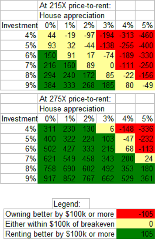
You can see that for a 215X multiple — the example used in the previous post — my base case scenario would be in yellow (2% appreciation, 7% investment returns). Being off by just two points (5% investment returns, 4% appreciation, or one percent to each) can flip the outcome from renting being better to owning being better. Enough that if you’re concerned about negative equity, or a flat-lining housing market, renting may indeed be a better choice. But not the hands-down outcome you may have been expecting given how important I feel the topic is. Perhaps I shot myself in the foot with my “even being generous to owning” strategy by giving people an out there.
So then look at how it all changes with a 275X multiple: very few scenarios where owning is better. At that price, you need to be both very pessimistic on equities and very optimistic on house prices to be dipping your toes into the real estate market. Again, you can find parameters where owning will yield a superior outcome, but how likely are those parameters? How big is the pain if you’re wrong?


 Questrade: use QPass 356624159378948
 Passiv is a tool that can connect to your Questrade account and make it easier to track and rebalance your portfolio, including the ability to make one-click trades.